
Landing Pages That Turn Clicks Into Leads
- Pagedrivers

- Mar 7
- 6 min read
A lot of businesses do not have a traffic problem. They have a page problem.
People click the ad, open the email, or find the service page through search - then they hit a wall. Too much text. Too many choices. No clear next step. That is where landing page design for lead generation either does its job or quietly wastes your budget.
A strong landing page is not just a nicer-looking web page. It is a focused sales tool built to move one specific audience toward one specific action. When it works, your offer feels clearer, your business looks more credible, and your lead quality improves.
What landing page design for lead generation actually means
A landing page is not your homepage with a form added to it. It is a standalone page with a single goal - get the visitor to take action.
That action might be booking a call, requesting a quote, downloading a guide, starting a trial, or asking for a demo. The page should remove friction between interest and action. Every section needs to support that goal. If it does not help the conversion, it probably does not belong there.
This is where many businesses get stuck. They try to explain everything at once. That usually comes from a good place. You know your service has depth, options, and nuance. But the page still needs discipline. The job is not to say everything. The job is to say the right things in the right order.
Start with message before design
Good design gets attention. Clear messaging gets leads.
Before choosing colors, layouts, or imagery, get brutally clear on three things: who the page is for, what problem they are trying to solve, and why your offer is a smart next step. If your page targets everyone, it converts no one particularly well.
A logistics company looking for a website rebuild needs a different message than a software founder looking for product demo requests. A trade business owner wants speed, trust, and proof you understand how they operate. A tech company may care more about clarity, product fit, and how quickly you can simplify a complicated offer.
The strongest landing pages make the visitor feel understood within seconds. That usually starts with a sharp headline, a short supporting statement, and a call to action that feels low-friction and relevant.
The best pages follow a simple conversion path
Visitors should not have to figure out where to look or what to do next. Strong landing page design for lead generation creates a straight path through the page.
1. Lead with a clear promise
The top section should answer three questions fast: what is this, who is it for, and what should I do next?
If your headline is clever but vague, you are making people work too hard. Clear beats clever most of the time. A subheading can add context, and the call to action should state the next step plainly, such as "Book a consultation" or "Request a quote."
2. Show the offer, not just the service
People respond better to a defined offer than a broad category. "Web design services" is generic. "Get a conversion-focused landing page built for your next campaign" is specific.
That does not mean you need to oversimplify. It means you need to package the value in a way that is easy to grasp. Visitors should understand what they are getting and why it matters.
3. Build trust before the form feels heavy
If you ask for contact details too early, before earning confidence, conversion drops. Trust comes from design quality, yes, but also from proof. Show testimonials, short case results, recognizable client types, or a concise explanation of your process.
For some audiences, especially in construction, trade, or B2B services, trust signals matter more than flashy visuals. They want to know you are credible, responsive, and capable of delivering without drama.
4. Reduce friction at the point of action
Long forms, too many required fields, and vague buttons create unnecessary drop-off. Ask only for what you need at this stage. If all you need is a name, email, and one line about the project, do not ask for ten fields.
There is a trade-off here. Shorter forms usually increase total leads, but longer forms can improve qualification. The right choice depends on your sales process, lead volume, and whether you value quantity or fit more.
Design choices that improve conversion
Visual design matters because it shapes attention. It tells visitors what is important, what is clickable, and whether your business feels current and credible.
But strong design for lead generation is less about decoration and more about control.
Use hierarchy to guide the eye
A good landing page has a visual rhythm. Headline first. Supporting copy second. Call to action third. Then proof, benefits, and objection handling.
If everything is bold, nothing stands out. If every section uses a different style, the page feels chaotic. Consistency creates confidence.
Keep the layout clean
White space is not empty space. It gives your message room to land. Crowded pages often come from the fear of leaving something out. The result is usually weaker, not stronger.
Clean layouts work especially well for businesses with complex services because they make the content feel manageable. That is often half the battle.
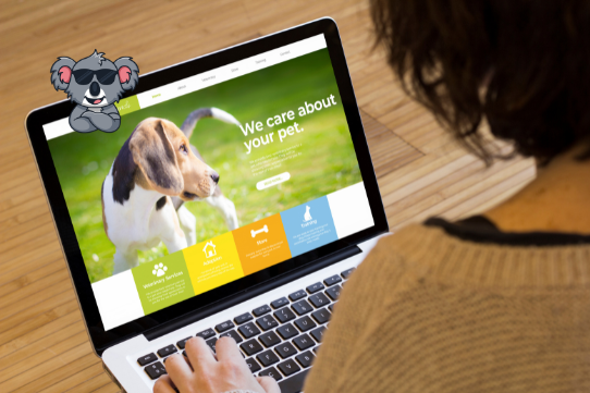
Use imagery with a job to do
Generic stock photos rarely help. Product screenshots, real team photos, process visuals, or simple graphics that explain the offer usually perform better because they add context.
If the image does not support understanding or trust, it is probably just taking up space.
Make mobile a priority, not a cleanup task
A surprising number of landing pages still feel like desktop pages squeezed onto a phone. That hurts results fast. On mobile, headlines need to stay punchy, forms need to be easy to complete, and buttons need room to breathe.
If your traffic is coming from social ads, mobile performance is not optional.
What high-converting pages include
There is no single perfect formula, but most effective pages include the same core ingredients.
A strong headline and supporting copy set the direction. Clear benefits show what improves for the visitor. Trust signals reduce hesitation. A focused call to action creates momentum. Then the page handles objections before they become exits.
That might mean answering practical questions like timeline, pricing structure, or what happens after someone submits the form. It might mean showing that you understand an industry-specific problem. It depends on what is stopping your audience from taking the next step. This is also why copying another company’s page rarely works as well as people hope. Their traffic source, sales process, and audience expectations may be completely different from yours.
Common mistakes that hurt lead generation
The biggest mistake is trying to make the page do too many jobs.
If the page is trying to rank in search, explain every service, tell your brand story, showcase the whole portfolio, and collect leads all at once, conversion usually suffers. A landing page needs focus. Another common issue is weak calls to action. Buttons like "Learn more" often feel passive and unclear. Better calls to action tell people exactly what happens next.
Then there is the mismatch problem. If the ad promises one thing and the landing page talks about something broader, trust breaks immediately. The page should feel like a direct continuation of the click.
Finally, many pages are launched and then ignored. No testing. No updates. No review of where people drop off. That leaves easy wins on the table.
Why testing matters more than opinions
Even experienced teams get surprised by what converts.
A shorter headline may beat a more polished one. A simpler form may double submissions. Moving testimonials higher on the page may improve trust. You do not always know until you test.
That said, not everything needs a massive experiment. Start with meaningful variables: headline, CTA wording, form length, section order, and proof placement. Track leads, but also track lead quality. A page that brings in more submissions but weaker opportunities is not necessarily performing better.
The best results usually come from combining strong strategy with ongoing refinement. Build the page with purpose, then improve it with evidence.
The page should match how your business sells
This part gets missed often.
If your business closes deals through consultation, your landing page should help someone start that conversation. If your product is easier to trial than explain, the page should reduce barriers to trying it. If your service requires trust and context, the page should do more education before the ask. That is why landing page design is not just a design task. It sits between marketing, sales, content, and user experience. When those pieces align, the page feels simple because the thinking behind it is sharp.
For businesses that need to simplify a complex service, move faster, and get more from their traffic, that alignment is where the real gains happen. At Pagedrivers, that is the work - stripping away noise, building clarity, and turning a page into something that pulls its weight.
A great landing page does not try to impress everyone. It speaks clearly to the right people and makes the next step feel obvious.


Many thanks for your always engaging articles. Great work.
Best regards,
Fanny
Complete correct. Good text.